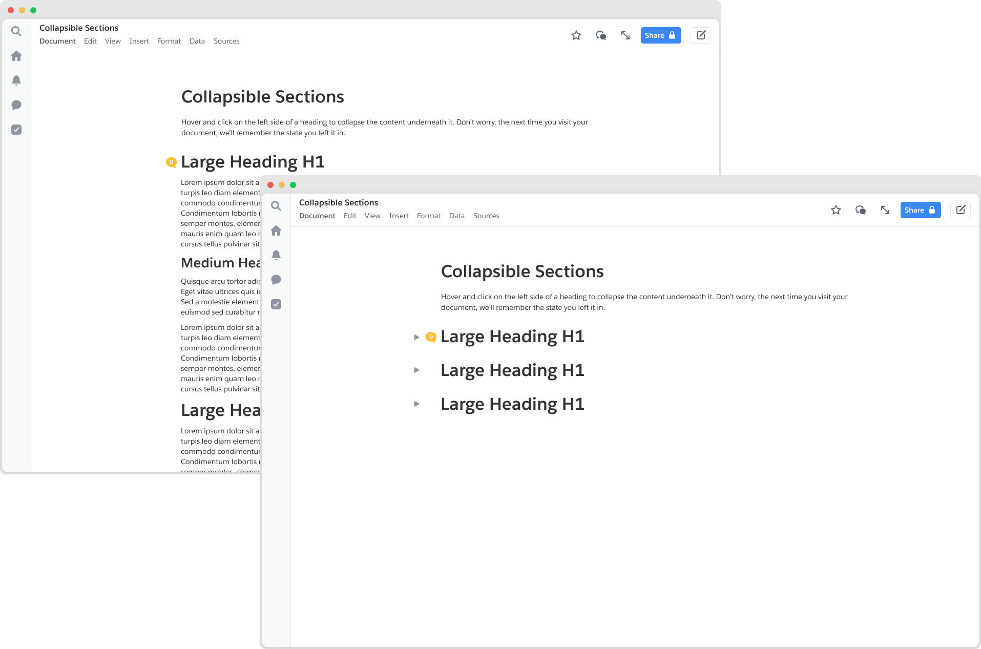
Not just an open and shut case: Collapsible sections
Led the design efforts for a highly requested document editing feature with a lot of edge cases.

Role
Design lead
Time
2021 (5 months)
Tags
Interaction design, UX deisgn
Intro
Every student, researcher, lawyer, writer, etc. out there knows that documents frequently suffer the affliction of length. Sometimes the material is redundant, sometimes it’s not organized coherently, sometimes it’s both. Regardless, the issue still stands: modern day documents are hard to read and oftentimes difficult to organize. Only the most meticulously organized of writers will even bother to slap in a table of contents.
This was the second project I picked up during my time at Quip. We anticipated it to be relatively simple (after all, many of our competitors already had it). However, further investigation revealed that this was anything but. What appeared to be simple behaviors were overloaded with contingencies and edge cases — behaviors so obscure, we realized no one had the right answers to them.
Motivations
[1] There was high user demand for it, especially in users who were familiar with other live document editors. This had been a top requested feature since the launch of Quip.
[2] Users found it difficult to navigate through lengthy documents. While we offered some tools to assist in this case, teams still struggled to organize long texts. This was a particularly poignant pain point for most of Quip's main user base: employees of large companies.
[3] Quip’s existing feature set did not optimize for many of the use cases our customers frequented (meeting agendas, PRDs, documentation etc.)
[4] Longer documents impacted the document’s performance. We hypothesized that this might be ameliorated if we could distribute the load time across collapsed sections.
Hypothesis and metrics of success
We believed that tis feature will improve navigation, improve document performance, and meet Quip customer pain points of managing large company documents. To measure success, we decided to measure document performance, track toggle/chevron usage, and collect qualitative feedback.
Global vs local
Because this was a new feature, we needed to make some structural assumptions about how the product worked before we moved on to the finer details. On a high level, we knew wanted to match the industry standard already set by Dropbox Paper, Notion, Coda and others. We also knew that there were features in our product that limited us from following their exact routes. One of the most important questions we had to answer first was: is the collapsed state global to all viewers, or is it viewer-specific? When I collapse a section, does it collapse for everybody? To answer this, we conducted comparative reviews and talked casually to some of our users.

At this point, we were quite sure that overwhelmingly, expanding/collapsing for consumption is best done locally. In user interviews as well, the expressed preference was almost universally for collapsing at the local level. However, we knew that local collapse negated the navigational value of a collapsed document. To assuage this, we expanded the scope slightly to include an expand all/collapse all feature.
Now that we knew on a high-level what our product required, we took a first pass at making some larger product decisions based on a loose competitive analysis we conducted earlier. Here are just a few:
Respecting heading hierarchy
Quip supported 3 levels of headings at the time of this project: large, medium, and small. Large headings could swallow medium headings, and medium headings could swallow small headings. If there were two equal sized headings in succession, they did not swallow each other. For (child) collapsed headings within (parent) collapsed headings, they would remain collapsed when the parent section is expanded.
Find and replace
If a user searches for a term that exists in a collapsed section, that section will uncollapse so that the user can view the context of that result.
Columns
A heading that enveloped a column layout could collapse the column layout, but if two headings existed side-by-side in a column layout, they could not be collapsible. Enabling collapse in a column structure introduced far too much complexity. We also assumed the use case for this was small.
Line numbers
If a user has line numbers turned on, the gutter content will cover the line number
Notifications/Anchor Links to Collapsed Content
Clicking on a notification that references collapsed content will cause the heading to be expanded. Memory: The collapsed state of a document will be local to the device that the user collapsed on.
Memory
The collapsed state of a document will be local to the device that the user collapsed on.

Endless edge cases
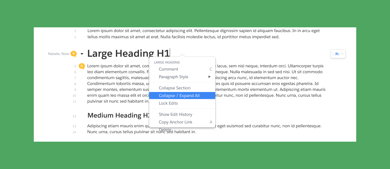
The first obvious designs revealed a series of edge cases and design implications that we had not considered before. I worked with with our engineer and product manager to identify the most pressing interaction questions and collaborate on potential solutions. In addressing the most pressing of these edge cases, the design shifted considerably. Where does the caret go when you press enter on a collapsed heading and it expands? What happens when a collapsed section gets deleted? Does the content get deleted or do they get expanded and only the header gets deleted?How should the document react if a user types underneath a collapsed header with plain text? Logically, it should get absorbed but that is poor UX.
Solving for the edges
.png)
Edge case 1: cleaning the gutter
The first obvious designs revealed a series of edge cases and design implications that we had not considered before. I worked with with our engineer and product manager to identify the most pressing interaction questions and collaborate on potential solutions. In addressing the most pressing of these edge cases, the design shifted considerably. Where does the caret go when you press enter on a collapsed heading and it expands? What happens when a collapsed section gets deleted? Does the content get deleted or do they get expanded and only the header gets deleted?How should the document react if a user types underneath a collapsed header with plain text? Logically, it should get absorbed but that is poor UX.
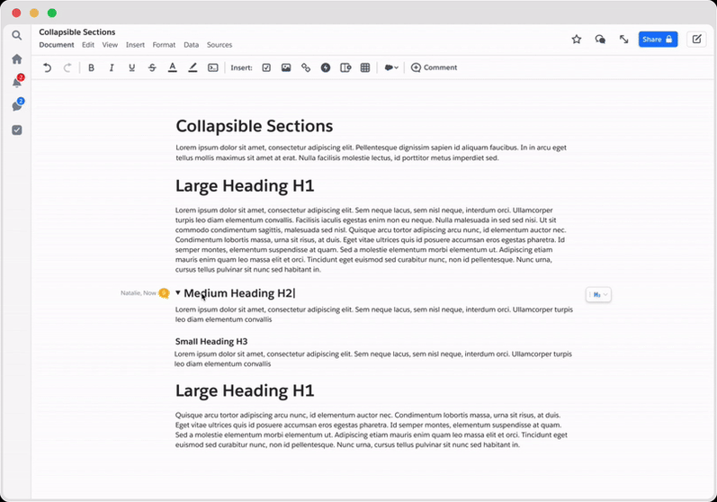
The below example was not compatible with hover and caused the comment icon to jump when a user tried to engage with it
The below example was not compatible with hover and caused the comment icon to jump when a user tried to engage with it

Edge case 2: accessibility
One caveat about the gutter was: screen readers couldn’t see it or use it. They accessed the contents via keyboard shortcuts. When a user is navigating through the headings, the screen reader will need to communicate to the user the state of the heading (collapsed/uncollapsed), and—if collapsed—how to uncollapse.
The solution we briefly floated was moving the chevron inline. We decided against this for two reasons: (1) this did not allow for any hover affordances for quick collapsing and (2) though the chevron is focusable in this design, it would not read out to the screen reader intuitively.
Instead, we decided to add in three accessibility assurances: Introduce a keystroke that will allow users to collapse and uncollapse a heading, announce to screen readers when a section is collapsed and how to uncollapse it. Do not use any aria-labels or put anything in the document if a section is not collapsed. Global collapse is off the table until this feature is fully accessible. Given that our solution was very bare-bones accessible, we didn’t want to risk locking screen reader users out of any part of a document.
Instead, we decided to add in three accessibility assurances: Introduce a keystroke that will allow users to collapse and uncollapse a heading, announce to screen readers when a section is collapsed and how to uncollapse it. Do not use any aria-labels or put anything in the document if a section is not collapsed. Global collapse is off the table until this feature is fully accessible. Given that our solution was very bare-bones accessible, we didn’t want to risk locking screen reader users out of any part of a document.

Edge case 3: copy and paste
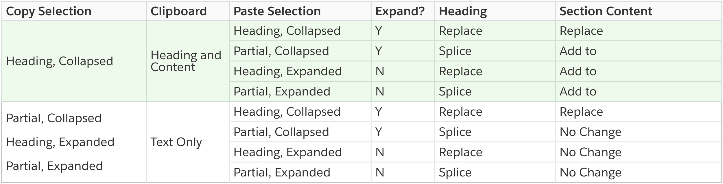
Copy and paste behavior was perhaps the most nuanced of the edge cases. There were numerous edge cases around copy behaviors that we had to design interactions for. What if a user copied a collapsed heading? What it copy the content inside as well? What if a user pasted over a selected collapsed heading? What does it look like to copy only the heading vs the heading and its contents? To address this, I created a matrix to illustrate the behaviors which I considered to be most intuitive and useful. Completing this exercise, we found unique copy+paste behaviors usually occurred when a user copied and/or pasted over a collapsed heading or multiple collapsed headings.Very importantly, we found that the difference between selecting just the text of a collapsed heading and selecting the entire section the collapsed heading led to very different outcomes. We'd need to represent these two states as best we could.

Engineering constraints + compromise
As it turns out, distinguishing between selecting the heading only and selecting the heading+section required us to create custom selection states (as opposed to relying on the browser standard). As it was now, users in Safari would have no trouble telling between the two, but Chrome users would be left in the dark. We determined that custom selection states required far more engineering power than we were prepared to invest in this project, and thus we were stuck with a dilemma: we needed to either allow the ambiguity to exist for Chrome users, or make it so that a triple click selection state behaved in the same way that a double click selection state did.
We ultimately decided that selecting a collapsed heading = selecting the heading and the contents in it for both the triple click and double click formats. We knew that this may deviate from the expected behavior for a few instances, but it also preserved the most content if someone copied and pasted incorrectly. If users noticed any discomfort, we would have a reason to build out the custom selection infrastructure.
We ultimately decided that selecting a collapsed heading = selecting the heading and the contents in it for both the triple click and double click formats. We knew that this may deviate from the expected behavior for a few instances, but it also preserved the most content if someone copied and pasted incorrectly. If users noticed any discomfort, we would have a reason to build out the custom selection infrastructure.
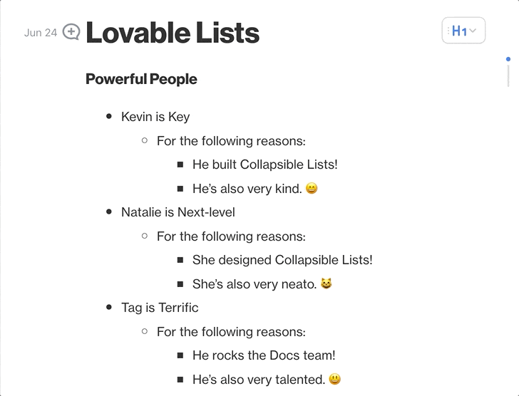
Edge case 4: collapsible lists
We knew we wanted to implement this alongside collapsible headings. The interactions for this feature were very similar but made slightly more complicated by the drag handle that appeared when a user hovered next to a list entity. We decided to replace the drag handle with the chevron icon and add in a tooltip to ensure that users knew the chevron also doubled as a drag handle.By and far, the trickiest portion of this design case was the copy content. We wanted to add a functionality of collapsing nested lists as well as an option to collapse all section items (including headings). How could we convey that collapsing all lists in a section did not mean that we would collapse all lists in the document? I worked with a copywriter here to test the best language.
Reflections
In retrospect, perhaps we should have assessed the contingencies more thoroughly before we assigned a timeline or allocated engineering support. However, given the fluctuations of our design process, it certainly turned out to be the most optimal outcome. Working collaboratively with my team allowed us to make quick and efficient changes. This was imperative as may of the interactions were only sussed out after testing the product live. Big thank you to my teammates Tag and Gabriel, who made this project a true pleasure to work on.


.png)